Coming Soon to Shattered: A Journal Overhaul!
Hey Adventurers, July is coming to an end and I owe you guys an update!
Unfortunately, I’m going to miss my earlier estimate of a beta during July. This is mainly due to v2.5.0 becoming a much bigger update than I originally planned. I’m now anticipating v2.5.0 will be ready for beta around the second full week of August. In the meantime though, let’s go over some of the new stuff that’s coming soon!
I was originally planning to make some targeted interface improvements to the journal in v2.5.0, but that slowly ballooned into almost totally overhauling it! In this blog post I’m going to mostly focus on those journal changes and other UI improvements, but there are some gameplay changes coming too, which I’ll cover in another blog post when the beta releases.
Adventuring Notes
The first major journal change comes to the adventuring notes section, which is currently laid out in a list view and records points of interest within the dungeon like unused keys and landmarks. The list layout and samey visuals end up making this UI pretty cumbersome though, and so it goes mostly unused.
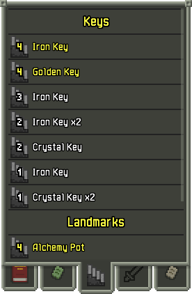
To remedy this, I’ve redone this UI with a more grid-based layout. This new UI is more compact and visual, which should make it much easier to see what important things are where at a glance. Individual grid items can also be selected to view a more detailed description. Thanks to the more compact UI, there’s also room to add some new landmark types, such as for special floors.
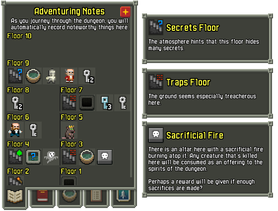
You might also notice that little ‘+’ icon on the top right, which leads into another new thing this UI supports. After years of requests, Shattered Pixel Dungeon is finally going to support user-enterable, custom notes!
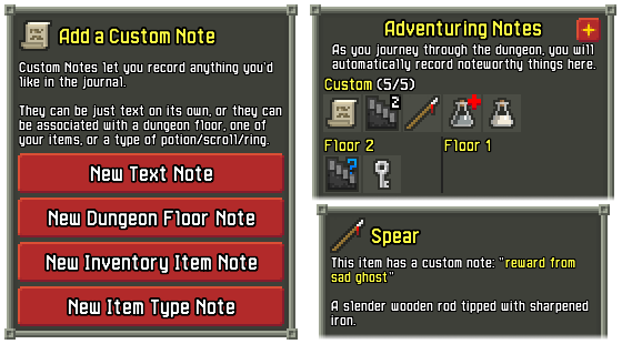
In v2.5.0 it will be possible to record custom notes and attached them to items or dungeon floors. These notes can contain whatever text you like, and even appear in the descriptions of items they are linked to. This will not only help people keep track of information between play sessions, but also lets players note down suspected properties of items they haven’t identified yet.
Catalogs
The catalogs are another part of the journal UI that’s badly in need of a more compact design. The current list UI contains every identifiable item in the game (about 100), and is full to bursting with 7 tabs and support for only about 9 items visible at once.
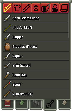
Just like with adventuring notes, I’ve moved catalogs to a new grid-based UI and expanded them massively. With the grid UI it’s possible to put many more items into the catalogs, and so I’ve expanded them from ~100 items total to instead include almost every item in the game!
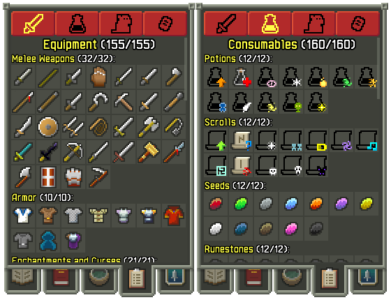
But why stop there? An in-game bestiary has been another common request, and so I decided to fullfill that demand too. The catalogs UI now also includes almost every character in the game, plus traps, plants, and lore documents in the final tab.
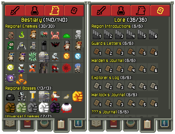
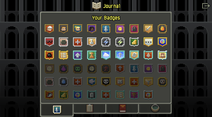
In total there are now just shy of 500 things in the catalog for players to discover! To go along with all these new things, I’ve also redesigned the badges that tie into the catalogs. There are 9 badges in total, 5 which are based on reaching certain thresholds of filled catalog entries, and 4 which are based on more specific criteria. The catalogs now also track a few statistics, such as how often an enemiy has been killed, how often a consumable has been used, and how often and equipment item has been upgraded.
Other Journal Changes
While those two interface overhauls are the biggest journal changes this update, there are a few important smaller ones as well:
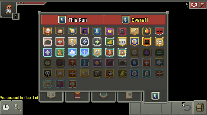
Badges are now viewable in-game using the journal UI. You can look at badges that you’ve earned this run, or badges overall. Previously it wasn’t actually possible to see a run’s unlocked badges until after it was completed.
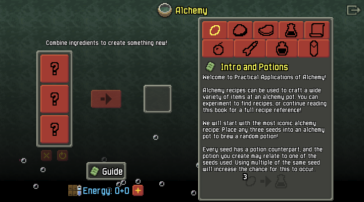
The alchemy guide can now be directly viewed in the alchemy scene if you’re playing on a large enough screen! This makes alchemy much more conveient in a similar way to how desktop users already enjoy an inventory pane in the main UI.
And lastly, the ‘badges’ button in the main UI has been replaced with a ‘journal’ button that lets you view badges, catalogs, and guidebooks from the main menu!
A New UI for Upgrade Scrolls
Also, while it’s not a journal change, one last significant UI adjustment coming to v2.5.0 concerns scrolls of upgrade.
Smart scroll of upgrade use is an extremely important part of effective game strategy, but despite that the game currently doesn’t do anything to actually show you how upgrades affect any particular item. In fact the only way to know how an item will respond to upgrading currently is to actually spend a scroll on it. I’m changing that in v2.5.0 by adding a new UI that summarizes how upgrading an item will affect it before the scroll of upgrade is actually used up!
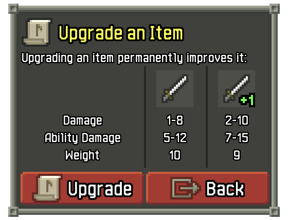
I hope that this will really help improve clarity on upgrading mechanics, especially for less experienced players. The window shows almost every stat in the game that scales with upgrades, properly handles cases like unidentified items, and even shows extra information such as curse or enchant removal chance!
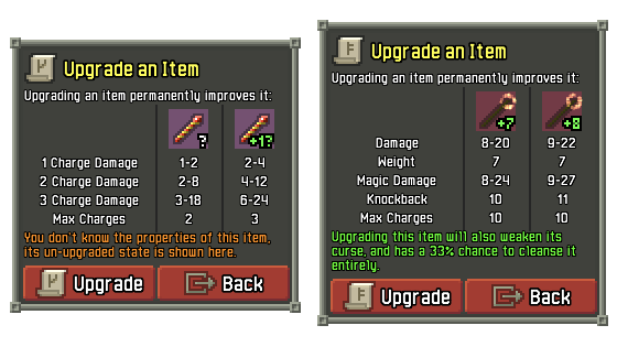
If you’re an experienced player and worry that this seems cumbersome, you might be happy to know that if you have multiple scrolls the window will automatically re-show itself after each upgrade, making dumping multiple upgrades into an item actually faster than before.
While all of these changes don’t directly affect gameplay, almost all of them are very long-standing things I’ve wanted to get done. While v2.5.0 isn’t addressing every UI/UX ‘to-do’ (in particular I still want to improve controller support) it’s definitely shrinking that list quite a bit. While it’s meant the update is coming a little later, this is a lot better than my original plan of just doing one or two things.
As I mentioned at the start of this post, I’m now expecting v2.5.0 to hit beta around mid August. Please keep in mind that while I always try to keep to the ETAs I provide, they are just estimates. If you don't hear from me by the ETA, it means I'm still busy with the update!
In the meantime you can subscribe to the ![]() Shattered Pixel Newsletter, or follow me on
Shattered Pixel Newsletter, or follow me on ![]() Mastodon if you’d like more frequent incremental updates.
Mastodon if you’d like more frequent incremental updates.
![]() If you enjoy Shattered and want to help me keep making it, please consider supporting me on Patreon! Patrons get access to exclusive weekly mini blogs about upcoming updates, monthly Q&As and content polls, physical loyalty rewards, and early alpha access to updates!
If you enjoy Shattered and want to help me keep making it, please consider supporting me on Patreon! Patrons get access to exclusive weekly mini blogs about upcoming updates, monthly Q&As and content polls, physical loyalty rewards, and early alpha access to updates!
You can discuss this blog post on the ![]() Pixel Dungeon Lemmy Community, or on the
Pixel Dungeon Lemmy Community, or on the ![]() Steam Community Forums!
Steam Community Forums!


