Shattered Pixel Dungeon v0.5.0: The Visual Overhaul!
It’s been almost 3 months since the last shattered update, time to fix that!
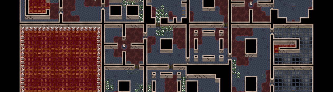
I’ve mentioned a few times that I have big plans for 2017, and this update is the first of them. Shattered Pixel Dungeon has adopted an entirely new visual style! The new graphics give an impression of depth: walls are raised, characters actually stand up on the floor, and characters & items cast shadows! The new style will also serve as a basis for future visual improvements. For now I’ve kept the style very close to the original game, but there is plenty of opportunity for lots of new, cool things with the extra visual dimension.
The update is available now through Google Play, and will be available to users on other platforms soon.
Here’s a full list of changes:
New Visuals!:
- Walls and some terrain now have depth
- Characters & items are raised & cast shadows
- Added a visible tile grid in the settings menu
- Various Bugfixes
- Translation Updates

Balance Changes:
- Quarterstaff armor bonus increased from 2 to 3
- Wand of Frost damage against chilled enemies
  reduced from -7.5% per turn of chill to -10%
- Wand of Transfusion self-damage reduced
  from 15% max hp per zap to 10% max hp per zap
- Dried Rose charges 20% faster and the ghost
  hero is stronger, especially at low levels
- Glyph of Entanglement activates less often
  but grants significantly more herbal armor
- Glyph of Stone armor bonus reduced
  from 2+level to 0+level
- Glyph of Antimagic magical damage resist
  reduced from 50% of armor to 33% of armor
- Glyph of Viscosity damage rate increased
  from 10% of deferred damage to 15%
- Exhausting Curse activates more often
New Visuals!:
Not many specifics to discuss here, best to get into the game and try them out! One thing to note regarding the visible tile grid though, it defaults to on at a very low setting, where it subtly darkens every other tile. While testing I found this subtle change was impossible to detect unless I focused on it, but it still helped with clearly seeing the tile grid. If you’re having trouble seeing where tiles are, try turning this up, it gets in the way of the visuals a bit but makes it really clear where you need to tap. You can of course turn it off completely too if you find it annoying even on very low.
Obviously the new visuals are a huge sudden change, and I expect more than a few people will get some whiplash. I have no plans to offer a toggle to the old style, but I do intend to continue improving the visuals to be the best they can be. If you have any feedback, please let me hear it.
Balance changes:
These are mostly minor adjustments meant to nudge items into line. They were all made after looking into data from player analytics, which I receive from players who have enabled google play services. Essentially, all of these items got nerfed or buffed because they were showing up in won runs a bit too often, or not quite often enough.