Coming Soon to Shattered: Improved Interfaces!
Hey Dungeoneers, Shattered v0.8.2 has just gone to beta, so let me share what’s coming!
v0.8.2 is primarily focused on some big interface improvements, as well as some smaller tweaks to game balance and mechanics. The title menu has been cleaned up a bit, the settings menu has been expanded, and there are new dedicated game screens for the supporter system and an ingame blog feed!
Also don’t worry, that new gameplay system is still coming! I opted to do one more smaller update before moving on to that, rather than trying to bundle all of these changes into the same update as the new gameplay system.
![]() If you enjoy Shattered and want to help me keep making it, please consider making a supporter purchase on Google Play, or supporting me on Patreon! Google Play Supporters get access to fun cosmetic in-game benefits. Patrons get access to weekly mini-blogs, monthly content polls, and a patron discord!
If you enjoy Shattered and want to help me keep making it, please consider making a supporter purchase on Google Play, or supporting me on Patreon! Google Play Supporters get access to fun cosmetic in-game benefits. Patrons get access to weekly mini-blogs, monthly content polls, and a patron discord!
A New ‘News’ Interface!
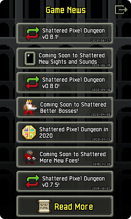
A little while ago I talked about wanting to improve the visibility of this blog to players who would otherwise just get info about the game from ingame updates. This is my attempt to accomplish that: A new dedicated ingame interface for the blog hosted here!

This interface pulls in a feed of articles from ShatteredPixel.com and will let players view their titles and summaries right from within the game! The game uses the website’s atom feed to accomplish this, and checks for articles whenever the game is launched. The whole feed is only 10kb, so data use should be minimal, however just to be sure I’ve made it so that the game doesn’t grab articles on metered networks (like mobile data) by default, and the player can even turn off checking for articles entirely if they want.
Shattered is currently played by a lot of people who’s interaction with the game begins and ends at the app itself. I don’t expect every player to want more, of course, but for many of them they simply don’t know that places like this website exist! My hope with this new interface is that it’ll become much easier for people to see what I’m working on, even if it’s been a month or more since the last update.
Main Menu, Settings, and Supporter UIs
With the addition of the news feed, I’ve also taken the opportunity to spruce up some other important interfaces as well! Firstly, the settings menu is getting some layout tweaks and two new tabs to fit in some new functionality. Some of the options are brand new, and some of them are being migrated from the main menu:

I’ve also taken the opportunity to spruce up Google Play Games functionality. The game is now more intelligent about sign in prompts (no more signin spam if you’re offline), and supports syncing journal data! Now that the Play Games icon is hidden in a menu, I’ve also decided to let the game auto-prompt new users to sign in when they first launch the game if they already have Google Play Games installed.

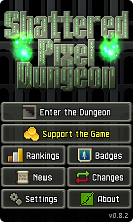
With several options moving into the settings menu, and the news interface, the main menu was bound to get some changes too. The settings menu is now a regular button, which means I’ve now totally cleaned up the space around the corners of the main menu. The news menu also gets a dedicated button, which blinks green if there are unread articles. The update notification is now also merged with the changes button, which will switch to ‘update’ and blink green if an update is available. All of these changes make the main menu interface a lot cleaner!

I’ve also moved the ‘support the game’ button up below ‘enter the dungeon’ and highlighted it in yellow. I appreciate it’s possible to go too far with this sort of thing, but I think this strikes a nice balance where the option is prominent, but not annoying. I want to make the button more prominent to encourage supporter purchases, but also don’t want to go as far as the old blinking effect the button used to have.
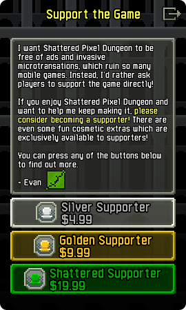
Lastly, the supporter window is now a proper game screen as well! This affects both the open source version (which just links to my Patreon), and the Google Play version, which features supporter IAP and cosmetic rewards. Migrating this interface to a proper scene not only gives me more space to expand it in the future, but also lets me be a bit more expressive with how it’s styled.
Any Gameplay Changes?
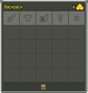
Unfortunately I don’t intend for v0.8.2 to feature any significant gameplay changes. In keeping with that design philosophy change I mentioned before, I wanted to keep v0.8.2 focused on interface adjustments and little else. I know that may be disappointing, but I think it’s for the best that- just kidding, here’s a fifth equip slot:

Okay so it’s an interface-focused gameplay adjustment, but a significant one nonetheless! Now, instead of the player having two slots that can contain either a ring or artifact, the player gets one ring slot, one artifact slot, and one slot that can house either! I’ve wanted to make this change for a long time, as rings and artifacts have always competed with each other just a bit too much. The general increase of difficulty from v0.8.0, plus the otherwise content-less nature of v0.8.2 makes now feel like the right time to actually make this change.
I’m not really out to make the game a whole lot easier than it is currently, but I feel that something like this is worth the difficulty decrease as it also really amps up the game’s fun factor. I’m very interested to see how this will affect gameplay, and what new interesting combinations players will come up with now that there’s more flexibility in misc items. In particular, I hope that this will lessen the feeling that specific powerful misc items (like the cloak of shadows) crowd out the misc slots when they’re present in a run.
You can discuss this blog post on the Pixel Dungeon Subreddit!
![]() Currently I’m hoping to release v0.8.2 around the middle of next week. All of the content changes I have planned for it are complete, so it’s just down to final balance tweaks and bugfixes. If you can’t wait though, there is a beta available right now! You can find the latest release of the game (including a beta, if one is running), on the game’s Github page here.
Currently I’m hoping to release v0.8.2 around the middle of next week. All of the content changes I have planned for it are complete, so it’s just down to final balance tweaks and bugfixes. If you can’t wait though, there is a beta available right now! You can find the latest release of the game (including a beta, if one is running), on the game’s Github page here.


